22Jan
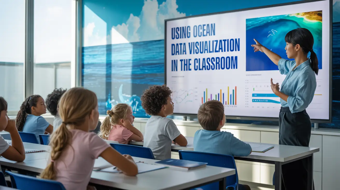
Using Ocean Data Visualization in the Classroom
Teaching ocean science can sometimes feel like trying to explain the size of the ocean with a teacup. The concepts are big, dynamic, and often invisible. That is where ocean data visualization in the classroom becomes a game changer. When students can see data move, change, and interact, learning stops being abstract and starts feeling real.
In this article, I will show how visualizing ocean data transforms lessons, boosts engagement, and helps students truly understand marine science rather than just memorize it.
Introduction to Ocean Data Visualization
Ocean Data Visualization
Ocean data visualization is the practice of turning raw ocean data into visual formats like charts, graphs, maps, and animations. Instead of reading long tables of numbers, students can explore patterns, trends, and relationships visually.
In a classroom setting, this approach connects science to real-world systems. Students are no longer just learning about oceans. They are learning from the ocean itself.
What Is Ocean Data Visualization
At its core, ocean data visualization converts complex datasets such as temperature, salinity, currents, or biodiversity into visuals that are easier to understand. Think of it as translating the ocean’s language into pictures.
These visuals might include interactive maps, animated graphs, or color-coded charts that show how ocean conditions change over time and space.
Why Visualization Matters in Education
The human brain processes visuals faster than text. That is why visual learning in science is so powerful. When students see data instead of just reading it, comprehension improves dramatically.
Visualization also supports different learning styles. Visual learners, analytical thinkers, and curious explorers all benefit from seeing science in action.
Key Takeaways
- Ocean data visualization in the classroom makes learning more engaging
- Visuals simplify complex ocean science concepts
- Real data builds critical thinking and curiosity
- Visualization supports inquiry-based and data driven learning
Benefits of Using Ocean Data in the Classroom
Ocean Data in the Classroom
Using real ocean data brings authenticity into lessons. Students feel like scientists, not just students.
Improving Student Engagement
Visual data naturally grabs attention. Interactive charts and animated maps turn passive listening into active exploration. This makes interactive science lessons far more effective.
When students can zoom, compare, and question data, participation increases and curiosity follows.
Making Complex Ocean Concepts Easier
Ocean systems are complex, but visuals break them into understandable pieces. For example, a color-coded temperature map instantly explains ocean warming better than paragraphs of explanation.
This approach supports data driven learning, where students discover meaning through observation rather than memorization.
Types of Ocean Data Used for Visualization
Ocean science covers many data types, and each offers unique teaching opportunities.
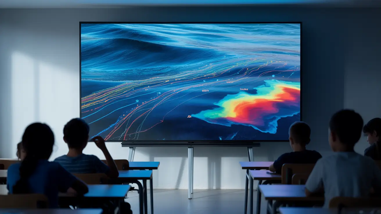
Physical Ocean Data Visualizations
Physical data includes temperature, currents, waves, and sea level. These are often shown using animated maps or time-series graphs.
Ocean data charts help students understand how physical forces shape climate and weather patterns.
Biological and Chemical Ocean Data
Biological data shows marine life distribution, plankton blooms, or biodiversity. Chemical data includes oxygen levels, nutrients, and acidity.
Using marine data graphs helps students see how living systems respond to environmental change.
Tools and Platforms for Ocean Data Visualization
Tools and Platforms for Ocean Data Visualization
Modern tools make ocean visualization accessible even in basic classrooms.
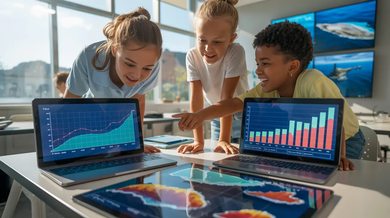
Interactive Charts and Graph Tools
Simple tools allow students to manipulate graphs and compare datasets. This builds confidence in reading and interpreting data.
Many data visualization tools for students are browser-based and easy to use.
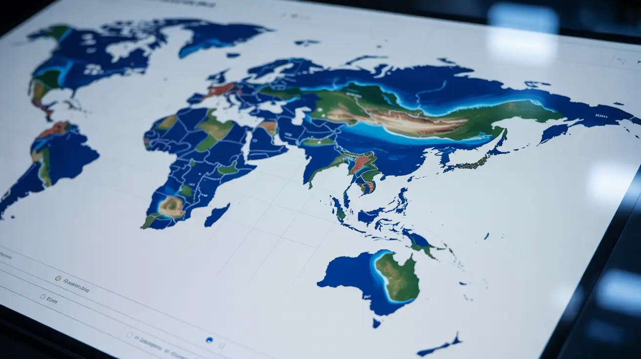
Maps and Geospatial Visualization Tools
Geospatial maps show where changes happen, not just when. Students can explore global ocean patterns visually.
These tools are especially powerful for teaching circulation, climate zones, and ecosystem distribution.
How Teachers Can Integrate Ocean Data Visualization
Visualization works best when it is woven into lessons, not added as an extra.
Lesson Planning with Visual Ocean Data
Teachers can start lessons with visuals to spark curiosity. A map or graph can introduce a topic before theory is explained.
This approach aligns with ocean science teaching tools that emphasize inquiry and exploration.
Project Based Learning Using Ocean Data

Project Based Learning
Projects allow students to investigate questions using real data. For example, students might analyze temperature trends or plankton growth.
These activities promote ownership, teamwork, and scientific thinking.
Ocean Data Visualization for Different Grade Levels
Visualization can be adapted to suit any age group.
Middle School Classroom Applications
For younger students, visuals should be simple and guided. Color-coded maps and basic graphs work best.
This builds early interest in teaching ocean science without overwhelming learners.
High School and University Level Use
Older students can handle complex datasets and independent analysis. They can compare variables, identify trends, and present findings.
This prepares them for advanced oceanography education and research.
Challenges of Using Ocean Data Visualization
While powerful, visualization does come with challenges.
Data Complexity and Interpretation Issues
Ocean data can be dense and confusing. Without guidance, students may misinterpret visuals.
Teachers must scaffold learning and explain what students are seeing and why it matters.
Technical and Resource Limitations
Not all classrooms have strong internet or devices. This can limit access to interactive tools.
Planning offline alternatives or simplified visuals helps overcome these barriers.
Best Practices for Teaching with Ocean Data Visuals
Good visualization teaching is intentional and student-focused.
Simplifying Data for Student Understanding
Start with one variable at a time. Gradually increase complexity as confidence grows.
This keeps classroom data visualization effective rather than overwhelming.
Encouraging Data Analysis and Discussion
Ask open-ended questions. What do you notice? Why might this be happening?
Discussion turns visuals into thinking tools, supporting visual learning in science.
Conclusion: Enhancing Learning Through Ocean Data Visualization
Using ocean data visualization in the classroom transforms how students learn science. It replaces passive learning with exploration, curiosity, and real-world connection. When students see the ocean through data, they understand not just how it works, but why it matters.
By integrating visuals thoughtfully, educators can turn complex ocean systems into engaging, meaningful learning experiences that stay with students long after the lesson ends.
Explore Real Ocean Data & Visual Tools 👉 https://oceanography.com/
FAQs
1. What is ocean data visualization in the classroom?
It is the use of visual tools like maps and graphs to teach ocean science using real data.
2. Why is visualization effective for teaching ocean science?
It simplifies complex systems and supports visual and analytical learning styles.
3. Can ocean data visualization be used without advanced technology?
Yes, printed charts and simple graphs can be very effective.
4. What age groups benefit from ocean data visualization?
All levels, from middle school to university, can benefit when visuals are age appropriate.
5. How does visualization support data driven learning?
Students analyze real data, draw conclusions, and ask scientific questions.
6. Are ocean data charts suitable for group work?
Yes, they work well for collaborative analysis and discussion.
7. What challenges do teachers face with data visualization?
Data complexity and limited technical resources are common challenges.
8. Can visualization help with climate change education?
Absolutely. Visual data makes climate trends easier to understand.
9. Do students need prior data skills?
No. Skills develop naturally through guided practice.
10. How does visualization improve engagement?
It turns abstract concepts into interactive experiences.